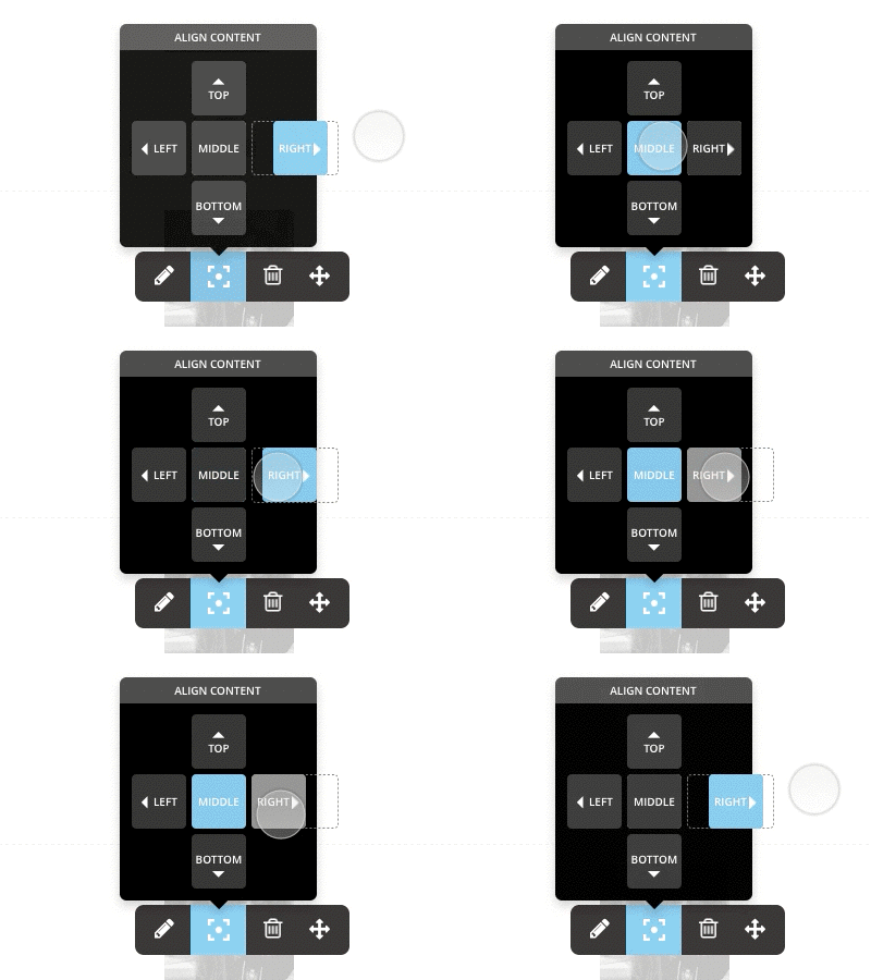
Align Content UI Idea
I'm working on an alignment solution for a simple WordPress page builder.
The multi-step button idea is used to pop the content outside the container, allowing for overlapping and breaking out the grid structure.
Any flaws that you expect?
— Subscribe to our mailing list to be among the first to find out when we launch the brand new version of PILE: http://eepurl.com/bUvb8f
More by pixelgrade View profile
Like
