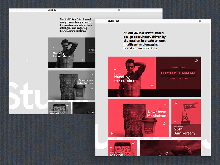
Mono or accent colour?
Currently updating the Studio–JQ semplice managed website, and wanted some feedback. Would you prefer a mono or accent colour for the portfolio thumbnails? The roll over is full colour.
Thoughts please!
Studio–JQ now has an account on Instagram, so please do give us a follow for daily inspiration and WIP's. StudioJQ on Instagram
Follow StudioJQ Behance | Twitter | Pinterest | Facebook All Works Copyright © 2016 StudioJQ.
More by MadeByStudioJQ View profile
Like

