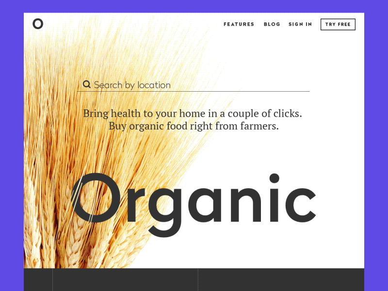
Landing Page Animation
Hello dribbblers,
Spring is growing at full strength here in Ukraine, so being inspired I would like to share something new here. Today my shot features one more webdesign concept, this time for a landing page whose aim is to promote the shop of organic food. It is composed in several blocks presenting the products, highlighting some important aspects of service, call to actions and testimonials. My aim was to make it informative but not overloaded, appealing but not aggressive.
Today we also have spring mood here in Tubik Studio working over diverse projects, accomplishing new design tasks on UI/UX, branding and animation as well as sharing our ideas, experience and recommendations in Tubik Blog. Don't miss the latest articles concentrated on different aspects of user-friendly and efficient design solutions. Stay tuned!


