NASA Homepage Concept
NASA Homepage concept, using the current iteration of my "NASA Modern Style Guide" I've been putting together over the past few months. I'll be providing a full picture of the concept on my portfolio site and updating the shot with a link to it when the case study is completed. (EDIT: Here it is! http://www.taylorpaschal.com/2016/03/21/nasa-website-concept-web-design/)
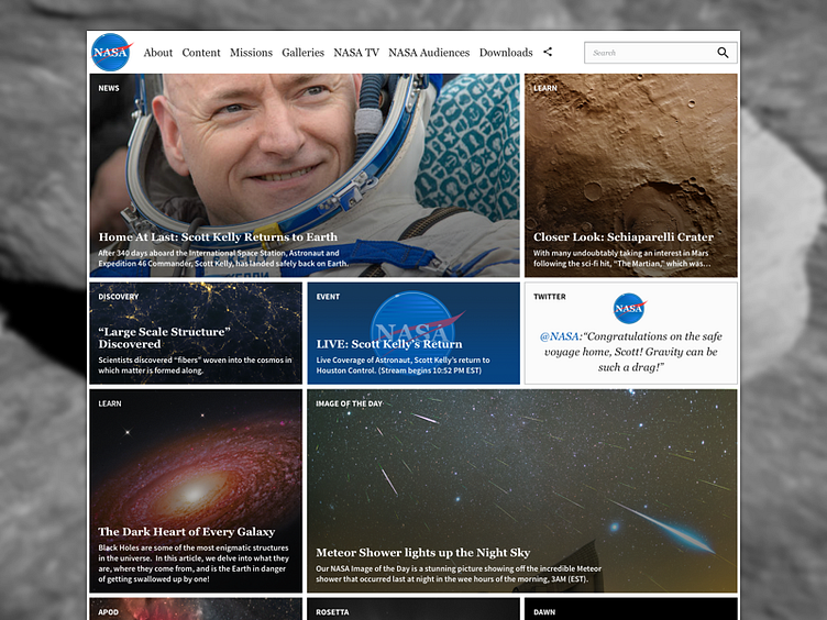
My goal for this page was to improve navigation and place the emphasis on well curated images from NASA. A look at the current site reveals clunky navigation, a dark background that bleeds into dark photos, and an overall "messy" presentation that detracts from the amazing work NASA is doing. I wanted to clean up the page with a refined style that does service to NASA's heritage as a pioneer in space exploration. With an updated logo, color palette, 12-column grid layout, and a font set that promotes better readability, this webpage redesign brings NASA's clunky online presence to the 21st century.
