Configuration Modal
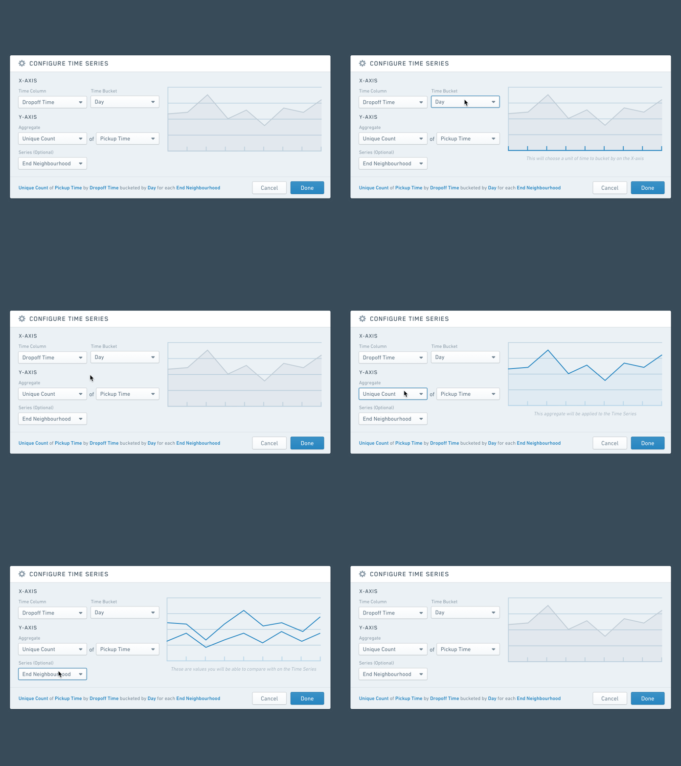
Here’s a quick look at the configuration modal I worked on recently for one of the many charts you can plot in our top-down data analysis tool.
It’s been interesting thinking about how to make this process approachable and usable for both first-time and power users.
We added a visual aid that would give users a much better idea of where the values they were choosing were going to be plotted. At the bottom of the modal, once properly configured, a one-line sentence also appears that summarizes the configuration in plain english. This ties in well with our in-line configuration, that allows you to quickly tweak charts in the app.
Check out the attachment for all of the other states for this modal.
Shout out to @Alexandru Antihi and @Andy Elder for working on previous concepts around this and @Nixie Melendres for helping create the smooth animation :).


