Lettering on a curve
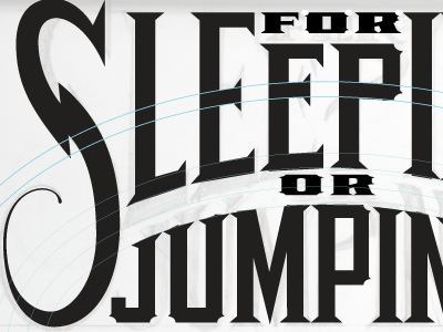
From my original sketches, I abandoned the "J" "U" and made some changes to a few glyphs to aid legibility. The "J" and "U" had curved bottoms that didn't work with the internal logic of the other glyphs. The only exceptions made here are for the titling "S" and "G" (Not pictured at the other end of this title). I'm not sure if Illustrator is capable of ellipse guides (anyone?), so I drew some concentric ellipses until they were where I needed them. In this stage, making sure the serifs abide to the concentric arches of the title is important as well as addressing the crossbars in the "E's" and "P". The P crossbar in "Jumping" is left alone for my own personal preference. Applying an arch filter works, but it will distort the letters, so this is done by hand, tweaking each node at a time.
