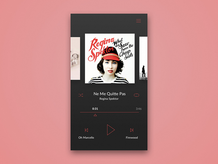
DailyUI 009
Day 9 of daily UI. I skipped a few days and hopefully I'll get them back. I end up spending more than 3 hrs per day and it's a bit overwhelming.
This interface is designed based on my own experience. I always felt a few things that don't work that well when I was using Spotify so I modified them and designed this UI.
I added the song title for the previous and next buttons because I feel it is rather informative and gives me control, instead of just skipping to the next song and guessing what it would be (especially for new albums). I also modified the album image on the top. Since in spotify, it is also used to switch to the next track, why don't I just make it, instead, to skip to the next album? This way I don't have a function that's exactly the same as another one. At the same time, in Spotify, these images are normally the same when you're in the same album, then it is completely useless to display these images again and again.
Lastly, a pain when using music players is that I don't have exact control over which moment I want to skip to. When I drag the pointer (the dot on the line in Spotify for instance, I have no idea what its official name is) to a different point, my fingers cover them and I can't see what exact moment I am going to. By employing a triangle below the line, the user can see the seconds change when they drag and have a better control as they don't cover the timeline with their fingers.
