Price chart
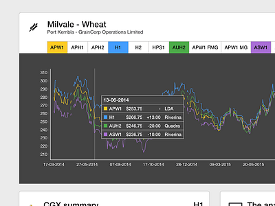
The ability to chart up to four different prices was added last week. The two new colours added were already part of the Profarmer colour palette so it made it easy to implement.
I'm still a bit unsure about adding green as a line in the chart. Green used within the app usually represents an increase in prices. I've made the assumption that the user will know a green line on the chart doesn't necessarily mean it is 'up' or 'positive' but it just representing the price.