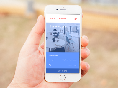
Knosey Key Mobile Screen - Sushi House
This is another screen for the the Designation.io admissions challenge. You can view some key information about the Sushi House, what sorts of aromas that it emotes, and where it is located.
The 'Eat Here' button is placed at the bottom of the screen, where the primary buttons are placed throughout the app; so that the user always knows where to look for it.
You can check out the full case study At my blog on Medium.
More by Brandon Herford View profile
Like
