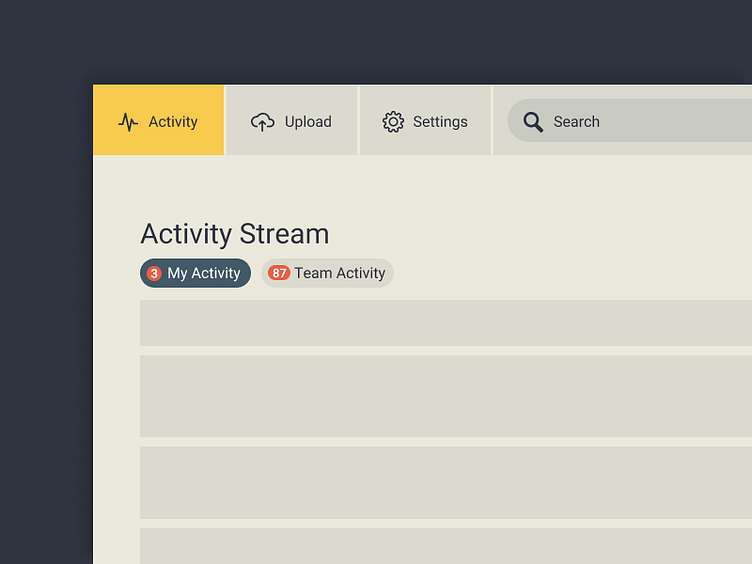
DAILY UI* - Navigation
For this navigation exercise, I focused on affordances for an app that lives on the web. I wanted everything to have target areas that looked clickable or tappable, and each one needed clear active and inactive states.
Made with Figma :)
* somewhat daily
More by Josh Goodell View profile
Like
