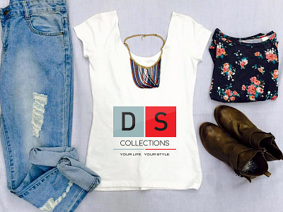
DS Collections logo redesign
Soo.. we were commissioned to redesign the existing logo of the DS Store; and we had to stay very very close to the existing brand.
The existing logo looked dated because of the pixel font it used and darker shades of color. Something had to be done to reflect the young female demographic it was targeting; and that dragged us to our drawing boards. Finally we decided that rather than changing anything drastic than how the brand looked previously, we re-imagined the logo with a cleaner and modern font; and picked web and print safe palette to make sure the colors appeared good in both print and screen.
The old logo is here.
More by Expresiv Studios View profile
Like
