Daily UI 003
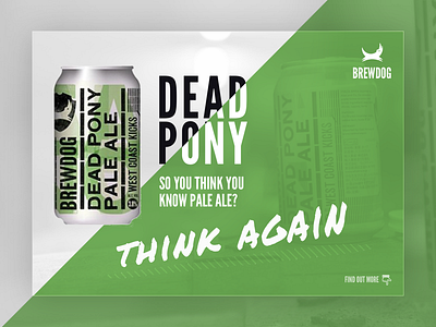
Another one to the daily ui challenge. A landing page.
Went a bit out of the ordinary for this one. Didn't follow a grid at all and just had a go at positioning and sizing of elements all by eye. I think it's turned out quite quirky, and fairly anarchic, which suits the Brewdog brand well.
Plus lets face it, who wouldn't want to a cold one right now?
If you like it hit L and as always, any feedback on how to improve is welcome. Cheers!
More by Tom Hill View profile
Like
