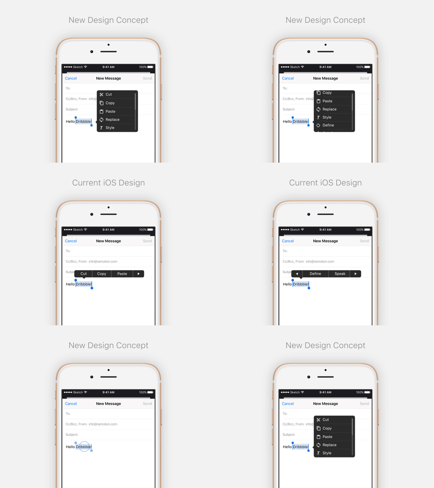
iOS Text Popover Concept
💎 Get inspired: UI/UX design projects
We keep experimenting with concepts that improve users experience.
Today we imagined how can we update the iOS native text popover, because right now the UX looks odd (with this arrows left and right and only 2-3 visible elements).
What do you think, colleagues?
More by Ramotion View profile
Services by Ramotion
Like
