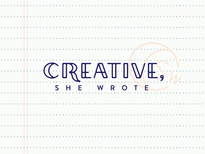
Creative She Wrote
This brand called for a logo that was simple, refined, and fresh and the custom type I created seemed to do just the trick. The journal pattern and “stamped” mark add a hint of mystery while the Parisian-inspired palette brings a bold yet feminine vibe.
I've got lots more to share from this one, and admittedly went a little pattern crazy. Just couldn't help myself :)
More by Spruce Rd. View profile
Like
