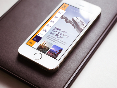
Airline Mobile Concept
Hey dribbbler's,
This time it's the mobile version of the concept I did for a European airline last year (not Lufthansa).
Would love to hear what you guys think about it. I tried to optimize the UX to fit the common tasks someone takes on an airline app/site with the mobile.
The search bar is kept in a vertical form to make it very easy to interact with the different options. Also in further shots I can show you how it will work once the search delivers results and how the search bar is very global and easy to change the search criteria at any given time.
Thanks!
More by Neonite Interactive View profile
Like
