Logolounge 7 - PD Fish Company
Following Breno Bitencourt's example I thought I would upload my single Logolounge 7 entry, I'm still quite proud of the motion and relevance in this one regardless of the bad client and terminated project.
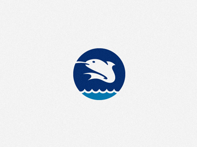
The line caught fish represents the sustainable nature of the produce while the waves develop the idea of open seas and freshness. I chose to go for a roundel for it's representation of sustainability, community and the earth.
This was the first of a two part identity project, the second logo-mark, designed for an accompanying butchery, can be seen here: http://www.richardbaird.com/logo-pd-food-service/