Crate Coven - Primary Logo

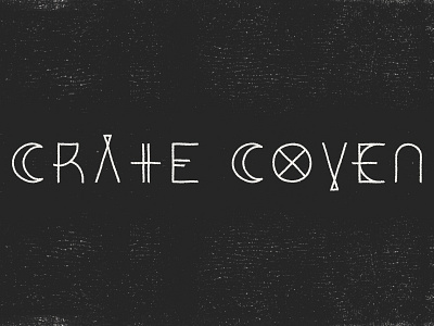
This new startup describes themselves simply as "A box subscription for witches and pagans" - awesome! We wanted a wordmark that was extremely simple, and had that ancient alchemy symbol feel to it. I couldn't have asked for better balance with the lettering - each word being the same amount of letters, and the middle letter of both words being able to be the opposite of one another - it was a dream come true to see this come to life.
My style continues to go darker and darker like this, and many of the other things I've been doing this year, and I am absolutely not complaining about that. Loving the vibe of this, and really excited to help them utilize it across a wide array of products in the future!