Daily UI 001
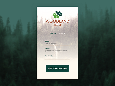
I decided to have a go at the Daily UI challenge. And first up was the Sign Up screen.
I decided not to make up a fictional company, and to pick something fairly close to me, which was the Woodland Trust Charity.
I took my inspiration from their own website, and attempted to stay fairly close to their current branding. Although (due to not having the fonts) this wasn't entirely possible, I think I have managed to stay fairly close to their brand.
Honest critique is welcome, after all that is the point of the challenge.
If you like it don't forget to hit L
More by Tom Hill View profile
Like
