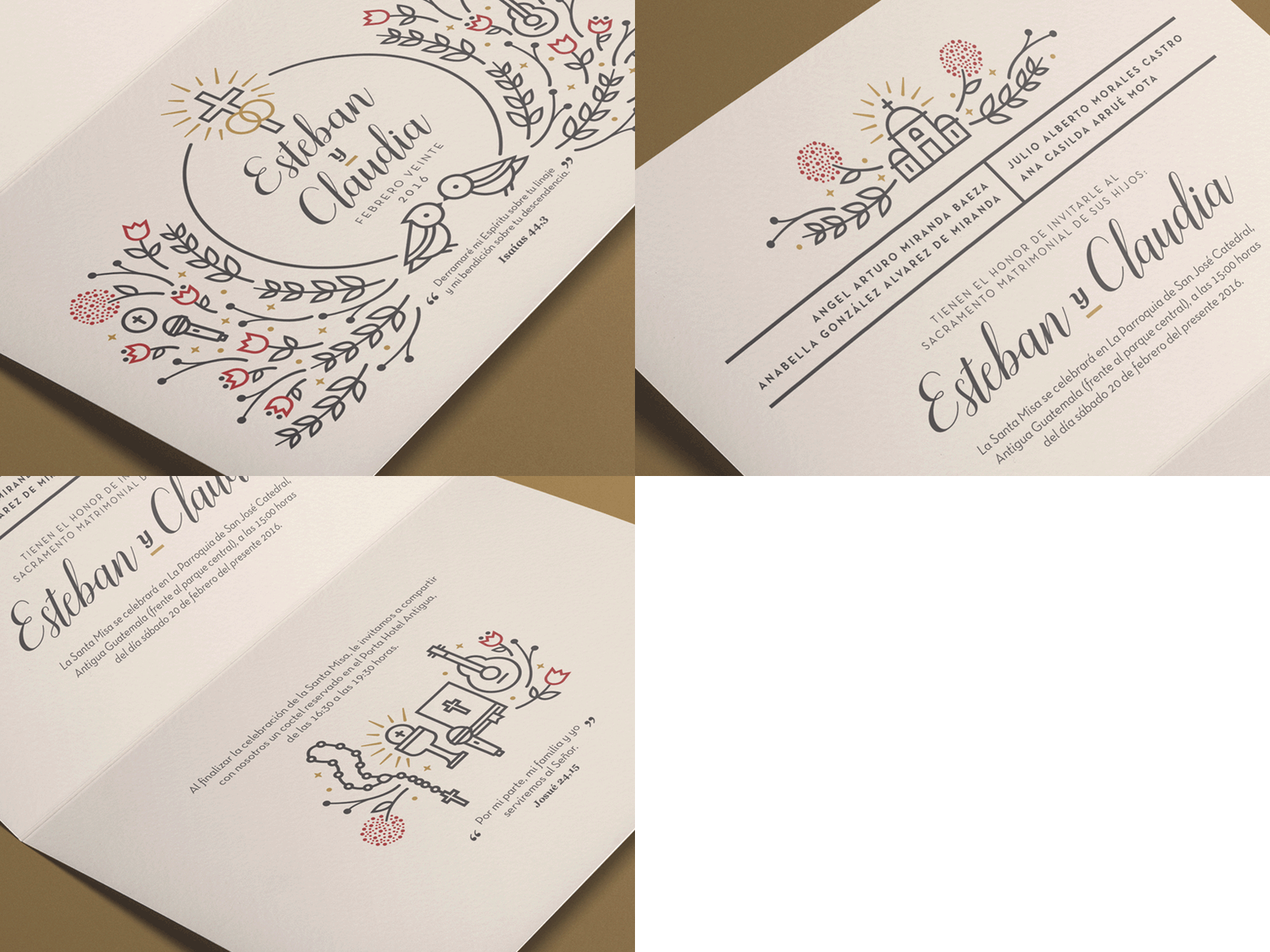
E&C Wedding Invite
As part of the E&C wedding invite project, these are the print shots of the final product. Since we established a colour palette to have an elegant, sober but warm aesthetic, we've also decided to go out with a textured bone white paper to ensure this. Also, we had to use a calligraphic font to highlight their names within the comp, while maintaining the classic elegant touch.
The best part of it, it is that thank God, both my friends and their families were pretty happy and satisfied with the final result. Again, I gotta say this is one of the best projects I've ever been involved. To me, just seeing them at the altar was my biggest paycheck.
More by Diego Diaz View profile
Like
