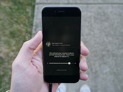
Music Player Volume UX
Have you ever put your headphones in and pressed the play button only to have your ears blown off because the sound isn't adjusted properly?! This happened to me last night for the millionth time and I thought of this. We need an experience to protect our ear drums from exploding!
I haven't uploaded any UX/UI in a while so I figured I'd put together this idea this afternoon. Here's how it works:
1. You press play
2. If the volume is above a "normal" level, you get this little modal. If not, it just proceeds as it usually would
3. It nicely suggests you adjust the volume while giving you a countdown of 5 or so seconds
4. You have the opportunity to adjust the volume within the time window
5. You are happy because the app prompted you instead of just blowing your ear drums out :)
I did this mockup in a Spotify like modal because that's the app I use. Really, the concept applies to all music apps. I also took that photo with my new camera :)
Let me know what you think!
