cvitch wip
Hi dribbblers,
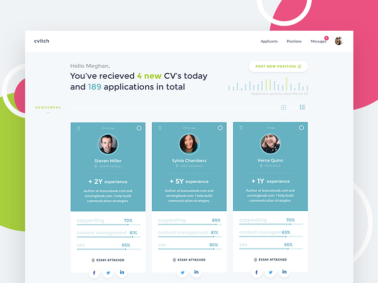
Sharing my recent ui/ux experiments. It happened that for a while I was using a lot of services for posting job positions. It turned out that most of them have the same problem of poor display of applicants. You see plain tables or lists and you need to open each item of those lists in separate tabs to make a brief estimation if this candidate matches your criteria or not. I think, and many HR managers will agree on this, that some applications can be skipped at first glance to save your time and increase the efficiency of finding the right person.
So dealing with all this pain, I've designed this screen that represents the dashboard of the HR manager (or any other person who is in hiring routine)
What do you think about? Does it have a potential to improve the hiring experience and represent candidates in more suitable way?