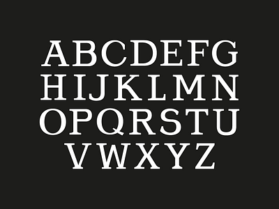
"Navy Pier" Font
This is a font I broke out based on the letters "Navy Pier" and the signage in Chicago. The letters there informed the rest of the alphabet, and overall it's a pretty wonky/quirky old-school serif font. There didn't seem to be a systematic approach to weighting the original letters so I kept that sentiment, mangling letters together and weighting them here and there in order to achieve equal weights from letter to letter. This is really the first serif/elaborately weighted font I've made so I'm sure it is riddled with type faux pas and lacks any real modern form of standardization in regards to it's method of weighting. I enjoy the quirkiness of it though, the "R" and the "K," and my favorite to make personally was the "S." The way the counters of the P and R are kind of squarish is cool. Going back I would probably make the C larger, G too obviously if I were to make it more standardized and "typographically correct" but then again it might lose it's old quirky feel if I did so.
