RockCouture Logo
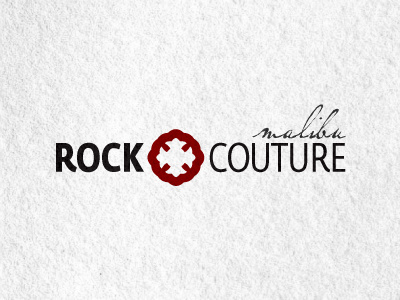
A new logo for a Florida based female clothing designer. This is a rebrand of sorts, as the previous logo has become too 'gothic' for them. It's also too detailed to now be used to create clothing labels as well as shrinking down much smaller sizes.
You can see the original logo and website here...
They wanted to soften up previous rock and gothic look, whilst still retaining an element of coolness and attitude. After a few discussions, I advised the client to retain a few key aspects of the orignal logo. As they have been successfully reading for a few years, there is a healthy existing client base, not to mention brand awareness.
The idea is to look at simplifying the whole look, without making it look dull. So the 'cross' has been reused and heavily simplified, as well as keeping the 'script' style wording for 'malibu'.
The font is Fedra Sans Condensed. A regular condensed font made it look too 'rock orientated', Fedra has a a few nice features that soften and pimp the general look and feel.
We may yet incorporate the 'wings' as can be found in the original logo. Although this would help keep the link to the old one, it makes the logo more rocky and gothic. So I felt removing these wings helped reduce that.
It's very early days, but this is an idea the client has already partially seen and is keen on exploring. The main focus is to create a neat and easy to reproduce logomark for printing and reproducing on clothing.
