Digital Healthcare
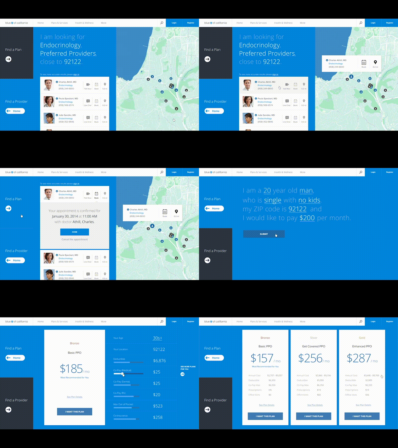
A few years back we worked with Blue Shield of CA on a few projects to help rethink how people interact with their health care providers online. This is just a small portion of our collaboration with their super talented internal design team.
One of the major things we tried to push was an update to accessibility for both the find a plan and find a provider which we proposed would always live on the right side of the screen and when clicked would slide out from the right side. After making it more accessible we wanted to figure out how we could make the process of finding a doctor more friendly and the act of selecting a plan less daunting and more tailored to a persons needs.
Our internal team consisted of me and @Sun Beom
More by BASIC® View profile
Like
