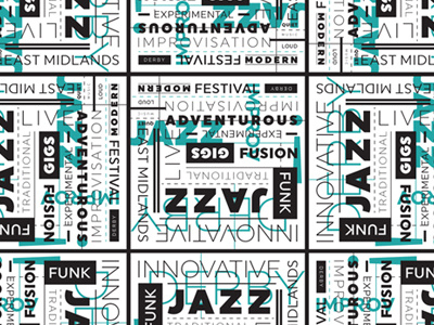
Out Front! Type Pattern
As soon as Corey pitched the idea of a Jazz festival I knew I wanted to do something a little out of the ordinary with the typography. We gathered a list of words that reflected the festival, I blasted out my Spotify and got lost in designing for a few hours. This is the result!
I only used the family of weights from the logo's typeface (Uniform), lines and stuck to our two colours. I created a repeating type pattern that I could use throughout the print and web design because I like using pattern in my work so don't see why I can't have a pattern from type! Not all of the words are legible but we think that's okay because it's something we're going to use for decoration.
It reminds me of the work I used to do as a student before I started working with clients. I have always loved David Carson's work and one of my favourite design books is Skyscraper I Love You from Tomato.
Granted, this style isn't appropriate for most clients but I think it works quite well for a music festival! The client, Corey is happy so that's all that matters. I was lucky for once to have a completely open brief and Corey trusted me to do whatever I felt was fitting!

