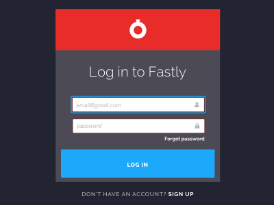
Log in: darkness
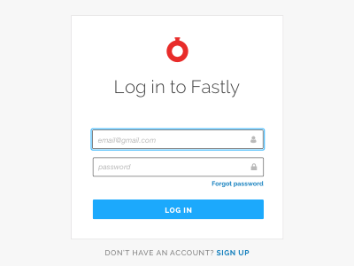
This direction uses dark neutrals in the background, and a strong red tile behind the logo. It's the furthest departure from our current more light and airy look, but the boldness feels strong and safe, which I want our customers to feel as they log in and use the app.
More by Fastly View profile
Like


