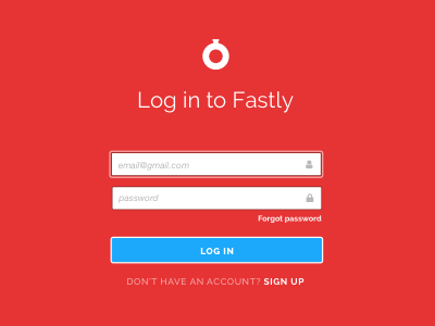
Log in screen: red
Trying some variations and ways to use updated branding and icons on our log in screen. This version is the reddest of the bunch - usually I avoid large pools of red (in life, and in interface design) but since the user is only on the log in screen briefly, it might be one opportunity to have strong brand impact before someone enters the much more subdued app interface.
More by Fastly View profile
Like

