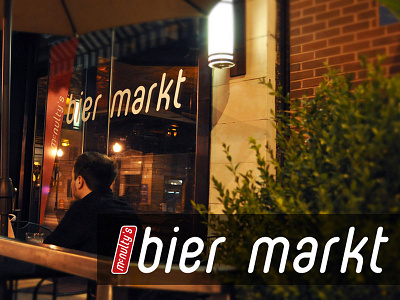
Bier Markt
Go Media cannot accept full credit for the resulting fame of the Bier Markt, but it has been among the most successful launches of a bar in Cleveland in the last decade. Draft Magazine voted Bier Markt as one of the best beer bars in America in 2009.
Sam McNulty, one of our long time clients, was opening a Belgian style beer bar (Bier Markt) in Cleveland’s hip Ohio City district. While the bar itself is an homage to the Belgian traditions of beer consumption, Sam requested a very clean, contemporary logo design. Additionally the bar was being opened in a historic neighborhood. This forced us to consider what type of exterior signage would be approved and how our identity system would work within those parameters. Finally, the Cleveland market is a cosmopolitan blend of young professionals that carry a blue-collar heritage, so the identity needed to communicate new and different without seeming exotic or superior.
There were three primary design motifs that I focused on while working on this branding project. Researching historic signs led me to a sign type that could be used for the building, a vertical blade sign. Drawing from this style sign, I came up with the shape of a vertical slanted rectangle with rounded corners. The second motif I used was that of a 50’s style diner. From this I took the red, black and white color scheme. The third motif was a very clean and somewhat modern style font. Since the “McMulty’s” part of the identity was secondary to the “Bier Markt” I decided to make it smaller and run it vertically in the rectangle which would mimic the layout of the signage on the exterior of the building.
