The Hopper Color Palette
We started 2016 off with some big updates to our Android app. As mentioned in the last shot, we brought our super-fast Quicktap booking to the platform; but users of the new app will se a host of updated and refined styling and design changes as well. This reflects what has been an ongoing effort by design to better understand our visual identity and how to apply it. You can read about it and the introduction of our new Quicktap booking feature here:
https://medium.com/@hopper_travel/new-year-new-hopper-aad3cec198a0#.j98krxj0d
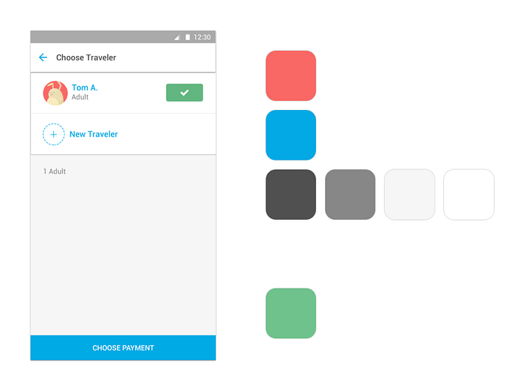
One of the big stylistic breakthroughs this release saw was a better understanding of our color palette specifically, an update to a few color values, and a more refined use of them throughout the app. I am really excited for how they lighten up the interface overall, with a heavy use of lighter tinted neutrals and sparing use of our pastel-inspired brand colors.