Ishtar Collective Category
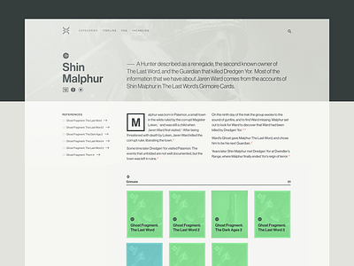
I wanted to share a few pages of the Ishtar Collective redesign and break down the design decisions that were made. First up, Categories!
If you look at the existing categories page you can see what I had to work with. This is one of the few sections of the site that has original writing, so there was a great opportunity to introduce some hierachy in the text because we could craft the content. I also took the opportunity to redraw the icons Baxter is using to start to create a visual language that more closely relates to the look in the game.
It was in laying out this page that I settled on the 11 column grid we will use across the site (11 because the 3 column width on the left was better proportionally than 4 and because screw it, I like a challenge)
The biggest design challenge here was representing the Grimoire cards in a way that let you see the artwork but leveled out the diverse look and feel and mitigated the oddness of the repeating art as well. The partial overlays add to the already noisy feel of the cards, so I went will a full overlay and pulled the colors out of the Confidence Level icons, which had the double effect of making the visual treatment more diverse while also carrying a UX meaning (the higher the confidence level the more closely tied the object is to the category)

