Real Estate Logo Brand
Logo for a real estate company focusing on remodeling and flippin' houses.
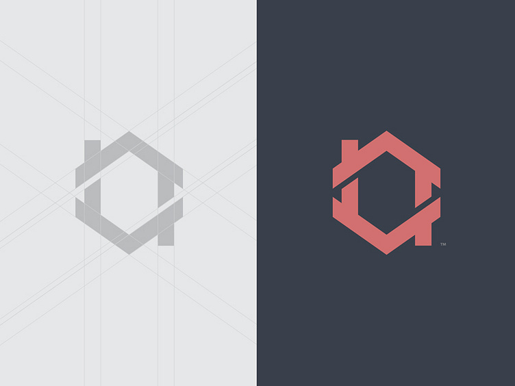
The concept displays 2 arrows to indicate the value of a property going up or down depending on the market. The chimney makes an obvious reference to a house The final piece makes up an intertwined symbol to represent the recycle process of remodeling and flipping a house.
Kind of digging the color palette, I will keep exploring.
