Dear everyone: better time zones
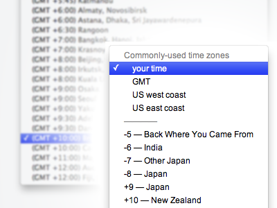
Enough with the standard time zone drop downs. They’re terribly annoying to use. I propose this one.
• It groups the most commonly chosen time zones at the top for easy access.
• It always has your time zone at the top, selected by default, detected by your IP.
• “(GMT” is omitted because we all know it, it's redundant, and prevents quick-type-selection in the dropdown (here, you can type “+10” to jump to New Zealand.)
Keep it in mind :)
More by Matt Pistachio View profile
Like
