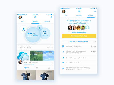
LinkedIn App Redesign
LinkedIn is one of the fastest growing company world wide; Recently, LinkedIn hit a milestone of 20 million users. This is a great win, but also a challenge to keep the best UX practices up.
I have a problem using the current version of the LinkedIn application. For some reason it feels dated and stuffy, the navigation is confusing. I never feel caught up the latest news, as a result I dread to log in.
Here I'm proposing a fresh new look and informational organization. List fresh colors along with summarizing data viz, which can be used as a menu as well. Clear distinction between functions helps to focus and promote the idea that the user has a control over the information, not the other way around!
I hope you "L"ike it!
More by Julia Grosman View profile
Like


