sprystack: landing page
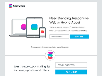

I really like the colors on this landing page. Its looks great up against the crisp white background. The white tint also lends itself to good use of typography in various size and weights. The new site is coming shortly, with this landing page in the interim, Check it out here: http://sprystack.com ...Thanks