Pontus Brenner Creative Studio

So I drank a lot of espressos this friday night and I thought I might polish my own graphic identity a bit.
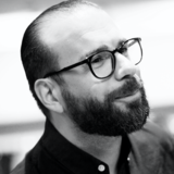
My signum has always been my glasses. I have worn them since i was 1 years old and never thought about ditching them. They are as much a part of me as any of my body parts. From that I noticed that if you tilt my initials p and b and mix around with them a little, they form the shape of a pair of glasses. After that i ditched the lowercase b and used two p´s, as the letters look the same only reflected.
Then I started to work on the rest of the logo and got inspired by the letter charts that is used by an Optician. From the charts I got the shapes to the different versions of the logo.
My personal style has always been a minimal one with a huge love of black. Together with the history, the logo it feels like something that has been apart of me for my whole life.