GO CUBES Chewable Coffee
GO CUBES Chewable Coffee (www.gocub.es) is a project my team I have been working on for almost a year. We launched about two weeks ago (http://goo.gl/5ToCSt) and sold out on Amazon in three days.
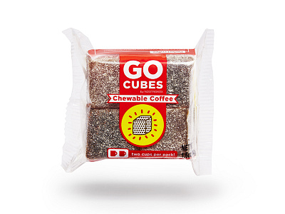
I did the brand identity, logo, and packaging design you see here. My team helped with concept, operations (actually getting the product to market), and web design. The product is a reinvention of coffee, optimizing for the performance & convenience use case by putting 2 cups of coffee into each pack, which fits easily into your pocket or backpack (or spacesuit!). GO CUBES contain L-Theanine & B Vitamins, which have been shown in repeated scientific trials to enhance the effects of caffeine for better performance on attention & focus tasks.
The art direction for GO CUBES borrows from the Pop Art aesthetic, inspired by Pop Art’s use of repeated dots and lines, bold bright colors, and simple symbolism. This look was chosen as a way of expressing an energetic intellectual vibe, in a way that’s familiar yet futuristic. This branding and packaging concept is perfect for the product because it helps the product to stand out as modern and bold, just like the original Pop Artists.
GO CUBES are a finalist for Inc. Magazine Best in Class Design Awards in the Packaging Design category.
