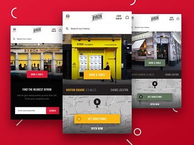
Byron Website Restyle
I used to love Byron Burger.
The concept is a location based website.
First screen is the Global Website (if user doesn't allow Location Services)
Second and third are location specific micro website.
As you guys might know, Byron is kinda no logo company, every restaurant is different (logo, store-front, interior design).
So, trough the CMS, the admin should be able to change easily accent colours, fonts and modules.
I hope you enjoy it.
More by Raimondo Taibi View profile
Like
