Financial App Overview
Hello Dribbblers!
Here comes the latest shot which I've completed today. It's for a "cash back" Android app on which we are working at Reinto right now. It allows you to save money while you are shopping - you get some money back for every (supported) item you buy.
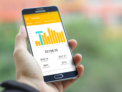
This screen is a kind of overview/dashboard data screen. It was quite a challenge to achieve this result as the instructions from our client were really short. In fact we obtained only an excel spreadsheet with lots of rows and columns full of numbers. At first it looked like there's no way to present the data in an eye-pleasing manner but I've managed to split them into few categories (tabs) so users can easily switch between them without being confused by information overload.
Active tab shows a historical chart of total last months' income and also individual cards for each month. The cards are being loaded on scroll. Check real pixels attachment for more details.
As always, I tried to combine simple usability and pleasing design - this screen is from a real app so it's not one of these beautiful but unreal concepts you can see quite often :)

