Behold Our God
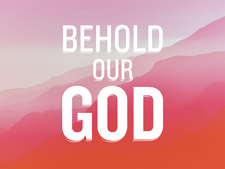
Artwork I put together for the 2016 Ocean City Bible Conference.
Some of my notes from working on it: "Going for large, resplendent, and majestic—trying to capture the 'heavens declare' idea. I chose a color scheme that was very bright, because I kept thinking about descriptions of heaven, the temple, and the tabernacle: lots of light, lots of gold, lots of brightness and saturation. I really wanted to capture that in the artwork. I wanted it to be really blown out, very light. I imagine it kind of like looking into the sun. Mountains worked well because they were instantly recognizable, conveyed enormity, yet were abstract enough to work as a background image without distracting from the main artwork. I used simple, bold text against the majestic mountains like a proclamation."
