Wedding Invite
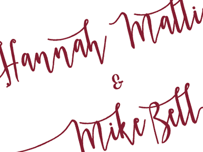
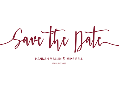
I kept the actual invite in the same vain as the save the dates, simple but striking typography. I love the contrast between the white and maroon and also the whitespace and jagged typeface.
For the purpose of Dribbble I've removed the sensitive information (church and reception location!) I'm looking forward to working on the RSVPs next week!
More by Katherine Cory View profile
Like


