Letter E - Logo Design, Monogram

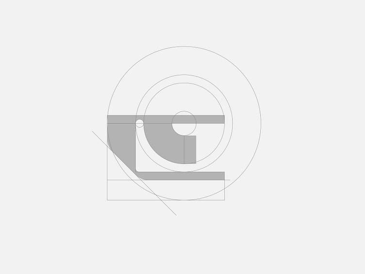
It turns out I haven't posted my daily design practice here for over a week! Continuing from my previous post, this time I'm experimenting with a lettermark logo concept—specifically, the letter E. And as usual, I'm heavily inspired by logo designs from the '70s and '80s.
Maybe this doesn’t even look like the letter E at all—perhaps it resembles a smiling face instead. I don’t know, what do you think? Can you still see it as the letter E?
Oh, and one more thing—maybe this isn't important, but I’m still working on this logo concept using Affinity Designer. I’m really trying hard to get used to the software, though I haven't fully adapted to it yet. Any of you also using it? How’s your experience so far?
Work inquiry: atmojodesign@gmail.com