Branding For Mrel
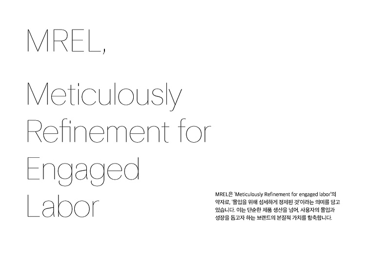
MREL stands for “Meticulously Refinement for Engaged Labor,” meaning “carefully refined for deep immersion.” It encapsulates the brand’s core value, which goes beyond mere product manufacturing to actively support users’ immersion and personal growth.
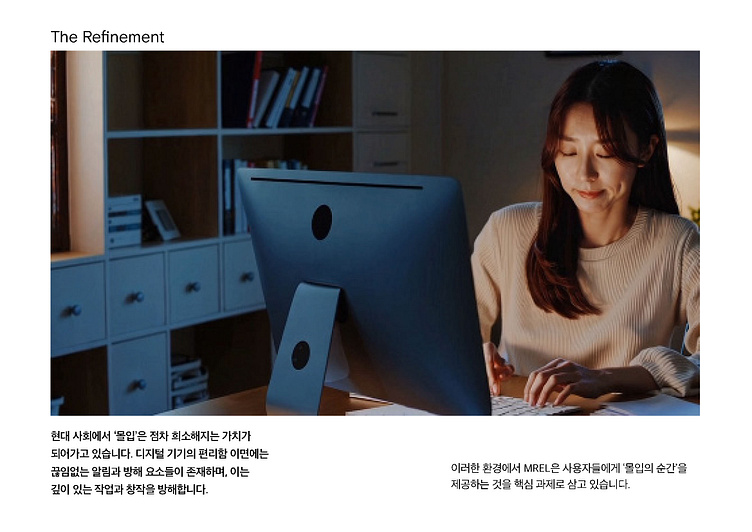
In contemporary society, “immersion” is becoming an increasingly rare value. Behind the convenience of digital devices lie endless notifications and distractions, hindering deep work and creativity.
Within this environment, MREL is dedicated to providing users with genuine “moments of immersion.”
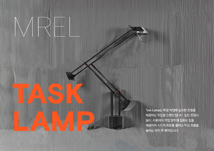
A Task Lamp is a lighting stand specifically designed to illuminate particular tasks. Unlike general lighting, its main purpose is to deliver focused illumination to the user’s workspace, reducing eye strain and enhancing productivity.

let me explain MREL’s design principles in detail. We've structured our brand design system around three core pillars.
The first pillar is Brand Core Values. This pillar emphasizes detail and quality through principles such as "Focus On Detail" and "Perfectionism," embodying more than mere meticulousness. It involves carefully considering every touchpoint a user encounters with our products and services, minimizing distractions, and creating environments conducive to deep immersion into essential values. For instance, our Task Lamp is meticulously designed—from the angle of illumination to interaction methods—to enhance users' immersive experiences.
The second pillar is Brand Identity. "Meticulously Refinement" represents our pursuit of structural completeness and coherence. It signifies how individual design elements interconnect organically, creating a unified system. This systematic approach ensures visual rhythm and an orderly structure, preventing unnecessary distraction and allowing users to focus clearly on core messages. Utilizing vertical design elements intuitively demonstrates this sophisticated completeness, effectively realizing our brand identity’s refined immersion.
The third pillar is Brand Mission. "For Striver, Focus On Essential" encapsulates our mission of prioritizing the essential. By removing extraneous elements and retaining only the core essentials, we adopt a minimalist approach. This creates an environment where users can deeply engage with fundamental values, free from visual noise or complexity. Ultimately, this approach ensures every interaction is not merely aesthetically pleasing but also meaningfully engaging, leading users to a profound understanding and appreciation of our brand’s value.
These three pillars (Brand Core Values, Identity, and Mission) are further articulated through three design principles:
Verticality: Uniformly spaced vertical line patterns and vertically arranged information provide visual order and stability. This naturally guides the user's gaze, facilitating smooth information flow and enhancing immersion without complexity.
Depth: Subtle variations in pattern density, layered effects, and detailed surface textures create visual depth. This encourages users to explore design elements closely, drawing attention to detail and ultimately immersing them deeper into the brand’s core values.
Restraint: Refined typography and minimalist expression remove unnecessary visual noise. This clarity allows users to focus directly on essential messages, naturally guiding them toward the immersive experience that our brand strives to deliver.
Ultimately, these pillars and principles complement each other, realizing MREL’s vision of multidimensional immersion. Consequently, users interacting with our products or services are provided not only visual satisfaction but also a meaningful, value-driven, and immersive experience.
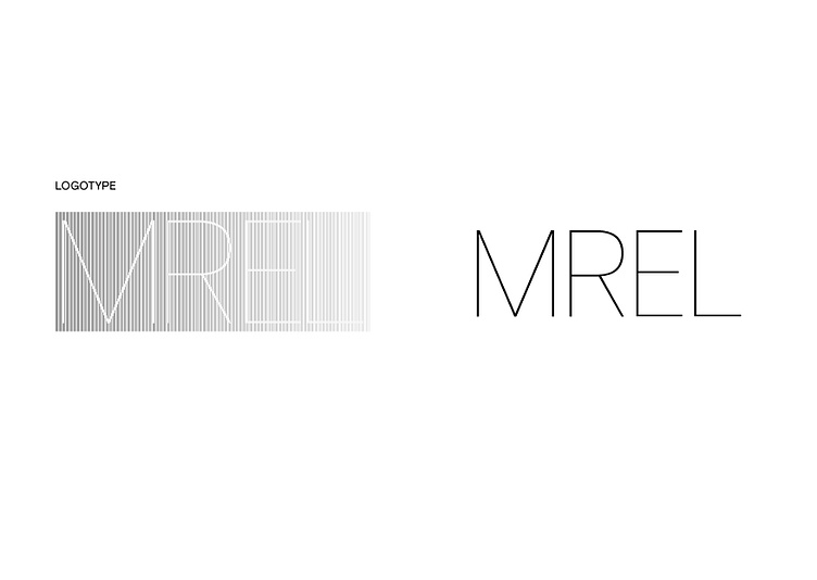
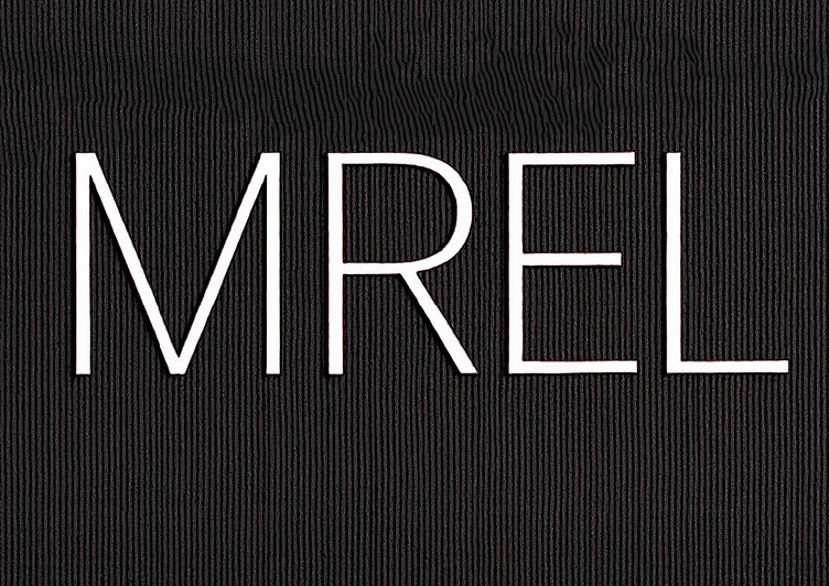
Visually examining the patterned logo reveals numerous thin vertical lines arranged at consistent intervals and varying thicknesses, collectively forming a letter. Upon closer inspection, the density variations of these monochromatic lines transcend simple flat graphics, suggesting a subtle visual texture akin to delicate embossing or layered effects. Instead of merely displaying the letters 'MREL,' these precisely arranged lines create visual depth, guiding the viewer's gaze through a journey of discovery toward the brand name.
The basic logotype embodies the 'Restraint' principle by eliminating unnecessary visual noise, enabling users to concentrate fully on the essential message. This visual refinement does not merely serve aesthetic purposes; rather, it ensures users remain undistracted, effectively channeling their focus toward the brand's core values.
These two versions of the logotype are flexibly employed depending on context and requirements. The patterned logo is utilized in situations demanding emphasis on brand depth and identity, whereas the basic logotype is preferred when clear readability is essential.
Thus, MREL's logotype serves not only as a brand identifier but also as a key visual representation of the values and philosophy we strive to embody.
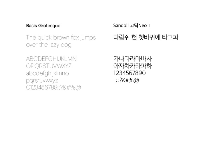
The typography system is another core means of reinforcing this immersive experience. Basis Grotesque, selected as the English typeface, is a modern sans-serif font developed by Colophon Foundry in the UK, characterized by restrained design and balanced proportions. While maintaining the straightforward clarity typical of traditional grotesque sans-serif fonts, Basis Grotesque incorporates subtle curves and appropriate spacing to soften its mechanical impression. It effectively combines clarity of information delivery with a sense of refined softness. Additionally, its high x-height and wide letterforms enhance readability even on small digital screens, and its variety of weights and widths accommodate diverse applications. These attributes help readers focus effortlessly on the message, fostering an environment of immersion without unnecessary visual distraction.
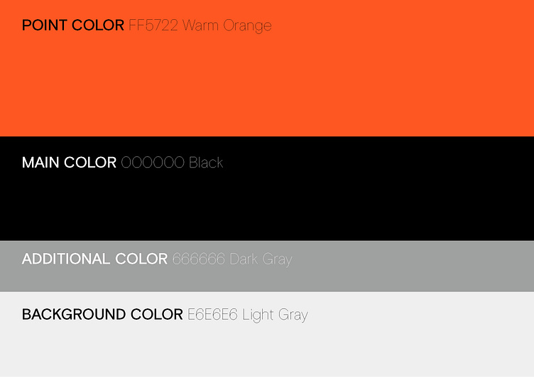
MREL’s color system is designed to achieve maximum effect through minimal use of colors, clearly conveying the brand's identity with just four key hues.
The color system further reinforces MREL's philosophy of refined minimalism. Recently updated, this system primarily features black and various shades of grayscale. Black serves as the deepest and most solid foundation, providing a stable background for all other visual elements, symbolizing unwavering immersion.
Grayscale tones progressively lighten from black, creating visual depth and hierarchy. This approach naturally prioritizes information, guiding the user's attention directly to core messages. Darker gray tones emphasize important information or key points, while lighter gray tones highlight margins or supplementary content, allowing users to seamlessly engage with essential information without visual noise. Ultimately, this gradual variation in color maintains user concentration without intense focal points, fostering deeper immersion into the brand’s core values within a cohesive visual order.

The packaging features a gradation of black and gray tones, with vertical patterns on the front creating a visual rhythm through subtle variations in thickness and spacing. This pattern is more than mere flat graphics; upon closer examination, it offers a visual texture that suggests depth. The intricate design invites tactile imagination, hinting at subtle embossing or surface variations that one could almost feel. This approach faithfully embodies the principles of 'Verticality' and 'Depth,' immediately stimulating sensory immersion through visual elements.
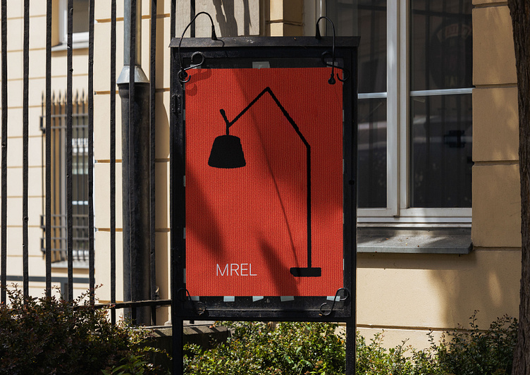
The poster demonstrates the principle of "For Striver, Focus On Essential" in an extreme way, composed solely of the Task Lamp silhouette against an orange background. This minimalistic form and limited color scheme allow immediate focus on the essential subject—the product. The black silhouette paired with a warm background evokes a canvas-like texture, prompting the viewer to imagine the materiality and depth even from afar. This visually suggested potential texture extends the 'Depth' principle, stimulating not only visual but tactile perceptions as well.
Consistently applied across packaging and posters, these design principles effectively communicate MREL’s core value of 'Meticulous Refinement for Engaged Labor.' Verticality ensures balanced visuals without distraction, Depth enhances sensory immersion by stimulating tactile imagination, and Restraint eliminates unnecessary ornamentation, creating environments conducive to complete immersion in the product and brand message.
True to its brand meaning—meticulously refined for immersion—MREL’s design system focuses on essential elements, removing distractions to achieve refined outcomes. Through vertical patterns, textured depth, and restrained use of color, MREL has crafted a distinct identity consistently applied from product packaging to promotional materials, providing a unified brand experience.
