Internet Archive Logo Redesign Concept
I absolutely love Internet Archive. It's one of the most important online resources and keeps the timeline of the web intact.
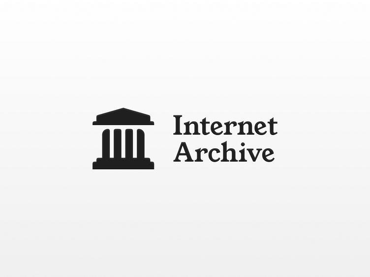
I redesigned its logo and wordmark with a refined grid and better overall balance, especially when viewed at smaller sizes.
For this redesign, it was important to keep the spirit of the original logo but update the depiction.
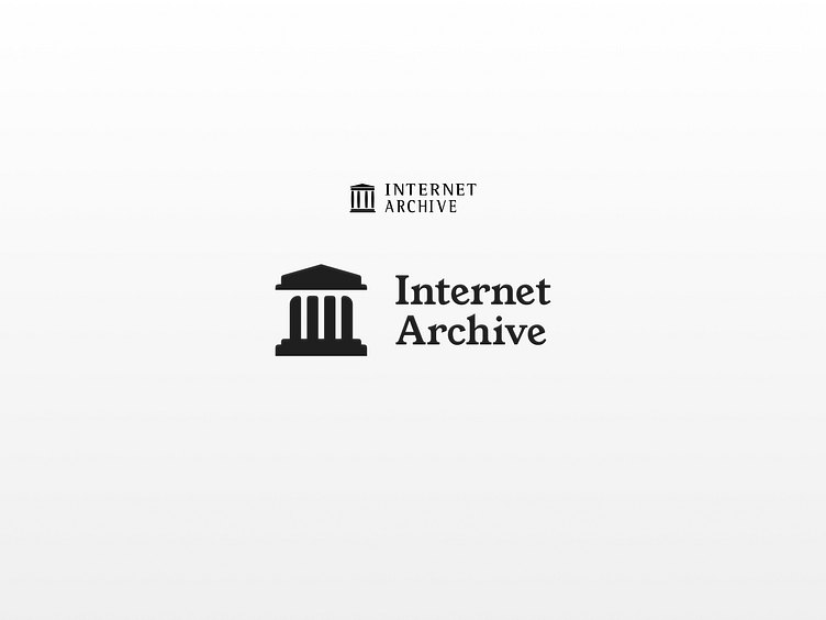
I redrew the logo with more consistency and weight. Subtle negative space creates the shadow from the building cast down on the columns.
For the wordmark, I used the typeface "Young Serif" by Bastien Sozeau.