Smart City - Lighting management app / Arabic, RTL interface
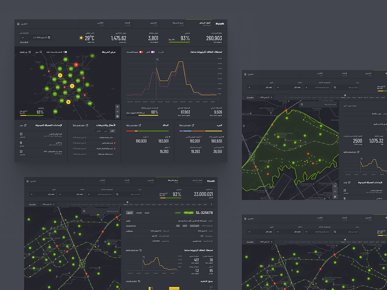
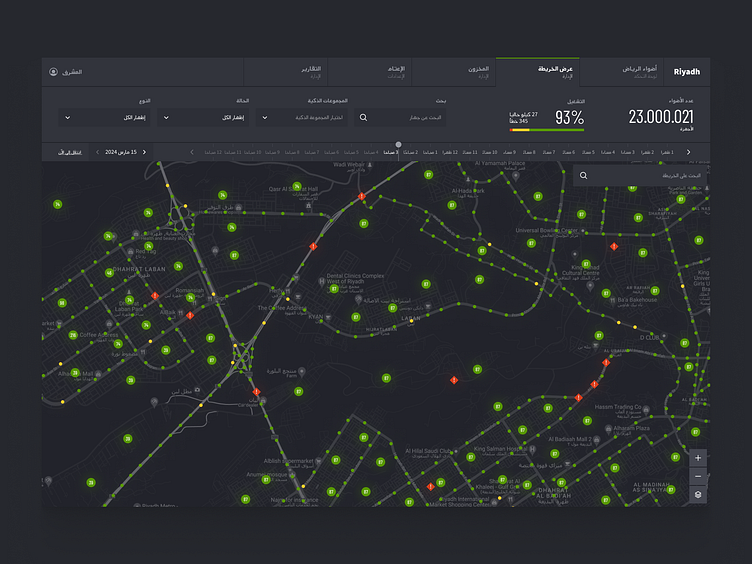
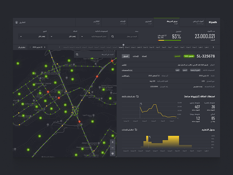
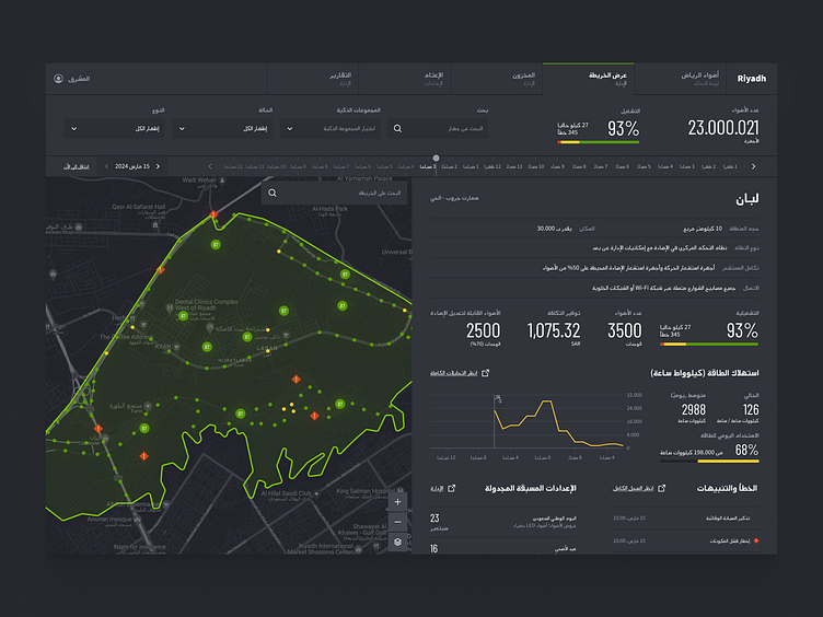
Advanced urban lighting management system for Riyadh's smart city infrastructure. The interface combines detailed analytics with geospatial visualization, allowing operators to monitor and control street lights.
The design balances data-rich information with an intuitive layout, using a dark background with bright accent colors for optimal visibility during night shifts. Green indicators represent functioning lights while red diamonds highlight areas requiring maintenance, creating an effective visual hierarchy for urban infrastructure management.

Designing for Right-to-Left (RTL) languages
✅ Mirroring the layout
Designing for RTL languages involves more than just mirroring the layout. While the interface itself is mirrored, not all of its elements follow this rule. Certain directional icons, such as arrows or cars, should be reversed, while others, like magnifying glasses or trash cans, remain unchanged. Elements that involve a clockwise motion, such as pie charts or loaders, don’t require any changes, and vertical steppers or progress bars can also stay the same. Video players maintain the same layout regardless of orientation.
✅ Text and number alignment
While text in RTL designs is right-aligned, numbers remain left-aligned, which can be challenging, especially in forms and data-heavy displays where text and numbers coexist. For instance, sliders with ranges can be tricky because we read the numbers left-to-right, but interpret their relationship right-to-left. Simplify these areas where possible to avoid confusion.
✅ Font and typography
Arabic script has different needs than Latin text, including more elaborate letter forms, different height, and spacing requirements. Arabic text is also typically longer than English, so designs need flexibility. Breaking long labels into two lines or using shorter alternatives can help maintain readability and design balance.
✅ Respecting cultural context
Design elements should reflect the local culture. Images, illustrations, and color choices should resonate with Arabic-speaking users. Consider culturally relevant visuals, such as appropriate clothing, skin tones, and environments, to ensure your design feels authentic.
✅ Hierarchy and readability
Clear hierarchy can be difficult in Arabic designs due to limited font styles and weights. Choose fonts that offer flexibility in creating headers, subheaders, and body text, while maintaining readability. Balancing visual hierarchy and clarity is essential for an effective interface.
✅ Bonus tip: Tackling Arabic app design
When designing apps in Arabic, start with LTR layouts if your client is comfortable with it, while keeping RTL requirements in mind. Create separate RTL assets and focus on mirroring only key views for proof of concept. This approach ensures your design works well when reversed, making it both efficient and user-friendly.
Intrigued?
👉 Follow us for more!
---
We’re available for new projects!
👉 Drop us a line: contact@merixstudio.com
About us:
🏆 Clutch
🎨 Behance