Chee-Rah — Playful Lifestyle Brand & Packaging Design
Chee-Rah is a joyful, quirky lifestyle brand that brings color and cheer to everyday moments. Designed for the free spirits and fun-lovers, Chee-Rah combines nostalgic playfulness with modern charm — a reminder to never take life too seriously.
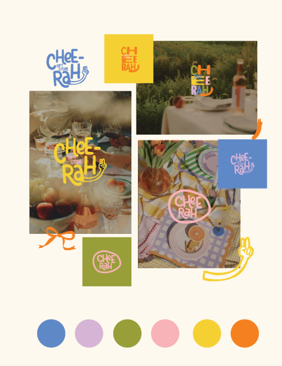
Creative Direction & Visual Identity Highlights:
Vibrant retro color palette — periwinkle blue, soft lilac, olive green, pastel pink, sunny yellow, and warm orange — creating a feel-good, approachable energy.
Playful, hand-lettered logo system with peace sign and smiley nods, giving off nostalgic, vintage store vibes.
Mix & match branding elements — flexible color swaps, various logo lockups, and versatile stamp-style icons perfect for packaging and merch.
Candid lifestyle imagery with vintage tones, blurred motion, and natural lighting, evoking laid-back gatherings and happy moments.
Casual, human touch elements like hand-drawn squiggles, peace signs, and playful typography — building a connection with a creative, youthful audience.
Tone & Feel:
Cheeky, light-hearted, nostalgic, and fun — Chee-Rah invites people to smile, savor life’s simple joys, and express themselves boldly.
Whether it's a gift store, lifestyle brand, or pop-up café, Chee-Rah is the brand that turns everyday experiences into colorful, memorable celebrations.