Hourly App UI Refresh
A refresh of a 7 year old app interface
About a year ago, my company and I set out to update and refresh our internally owned and developed time tracking application, Hourly Time. We began the journey of refreshing the Hourly brand by designing and developing a new website to engage existing customers and introduce new ones to the updated brand identity. You can find my previous post about the first stage here.
Since late December, I have shifted my focus from the completed website to redesigning the application itself. With this new phase of the Hourly Time refresh process, I have moved from using Adobe XD to create the UI and interaction animations to Figma, which is more of an industry-standard design tool. I have found Figma to be overall more intuitive software, but Adobe XD still offers superior navigation and shortcuts. However, for creating all graphics, illustrations, and images, I am still using the Adobe Suite, mainly Illustrator and Photoshop.
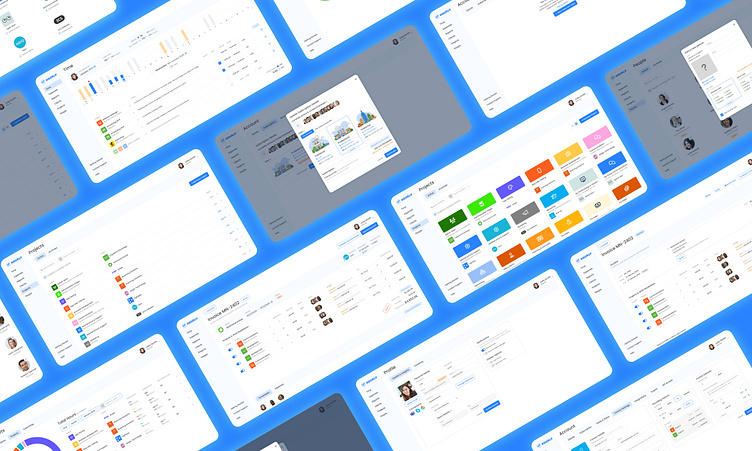
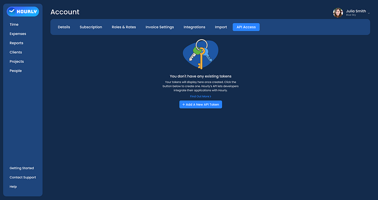
The UI below provides a preview of what the final update for the Hourly software will look like. As this is a very large project with only four people working on it, it will take time to develop and release everything I have designed so far. However, some of the UI has already been developed, and we’re aiming for it to be deployed to the public by the end of Q1 2025.
I would love any and all feedback from the Dribbble community, as I am currently a design team of one. I hope you enjoy!
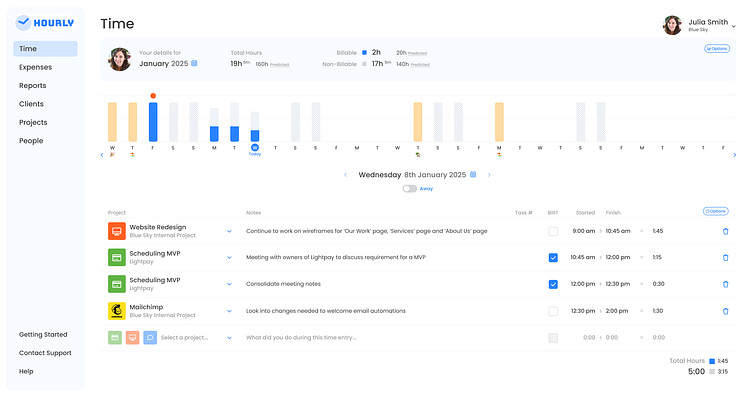
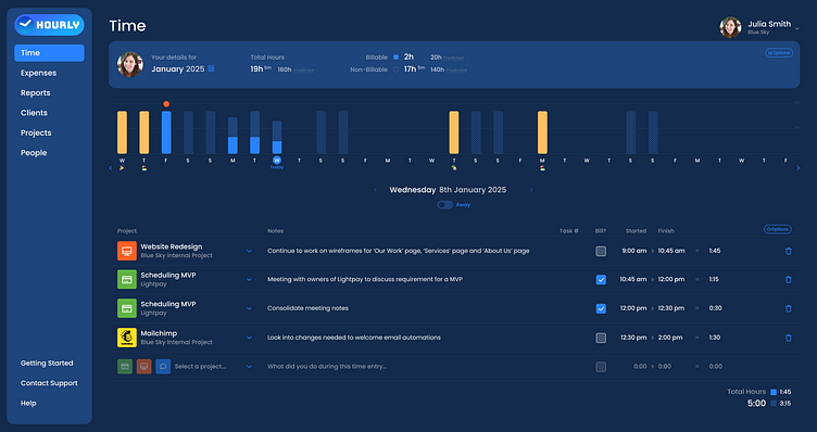
The above images show the UI mockups for the Hourly app's 'time' page in both the light mode and the dark mode.
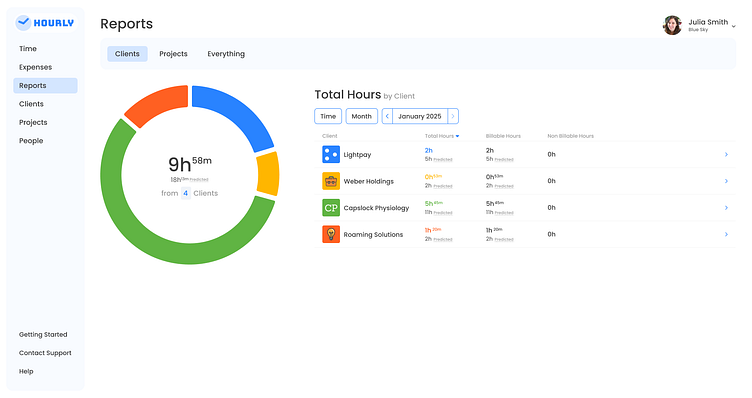
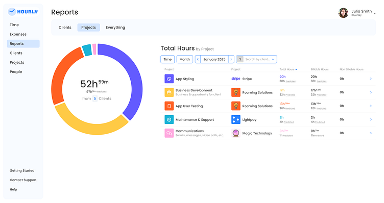
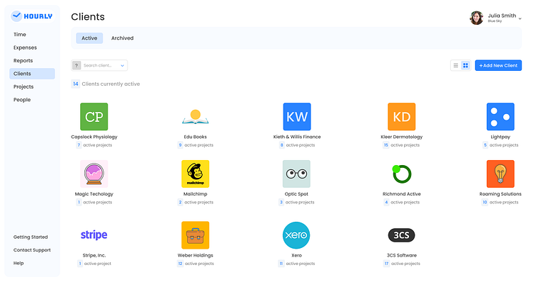
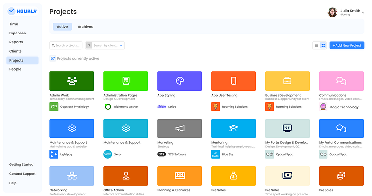
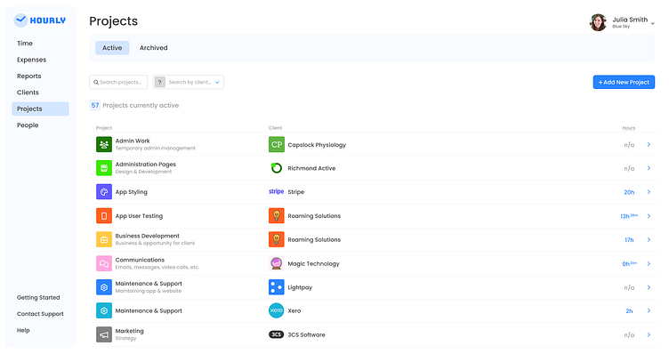
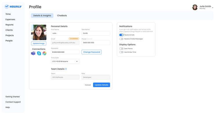
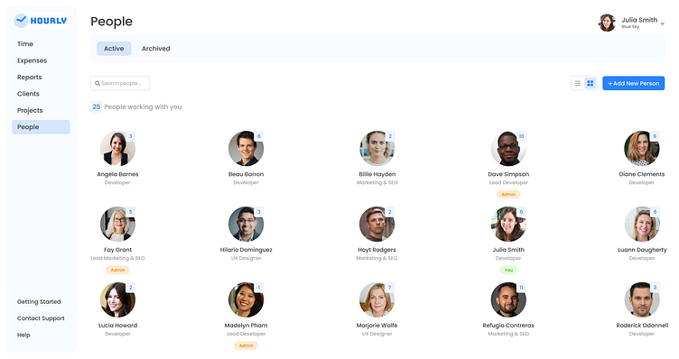
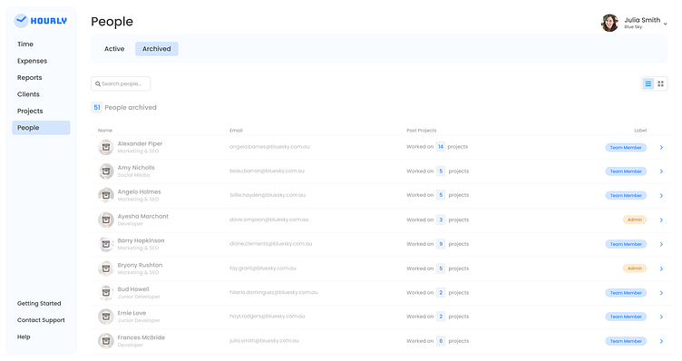
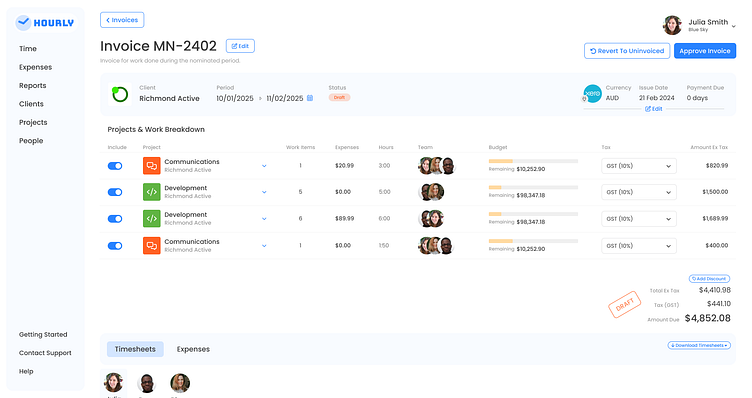
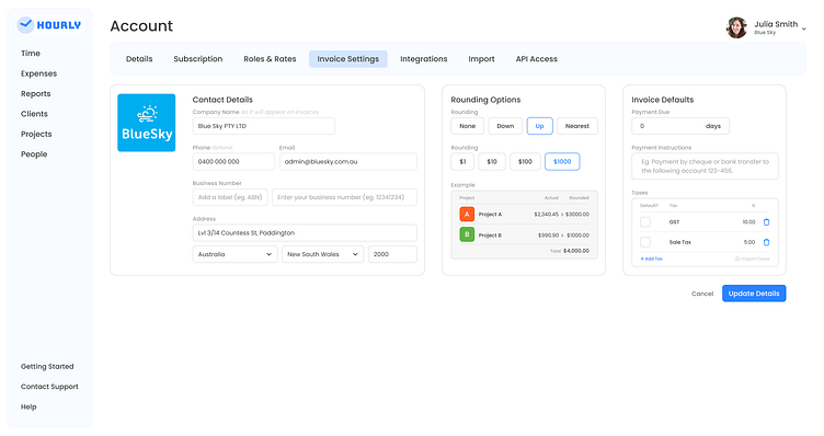

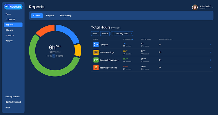
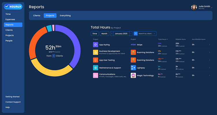
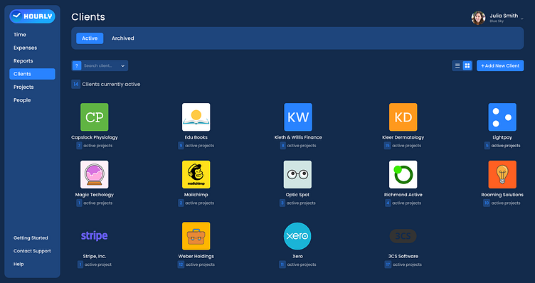
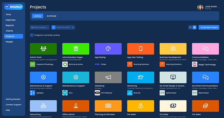
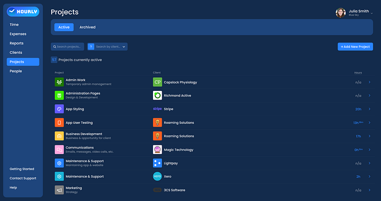
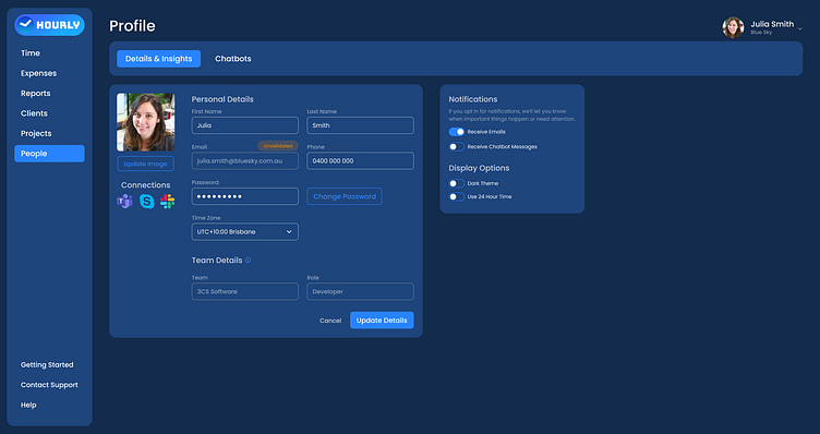

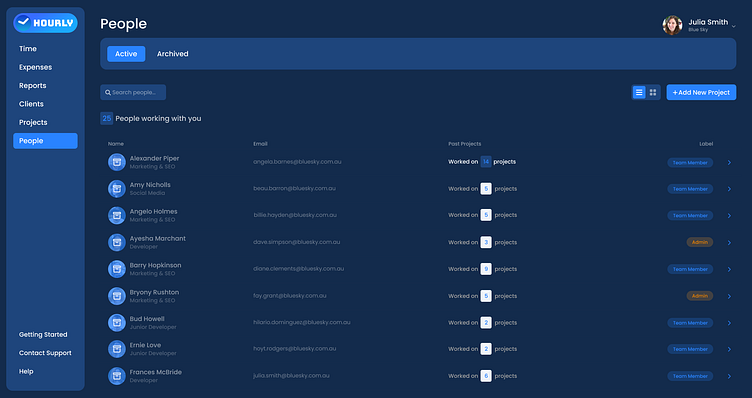
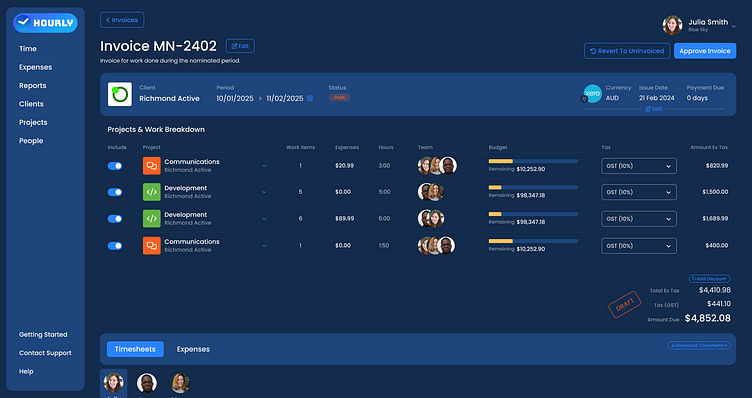
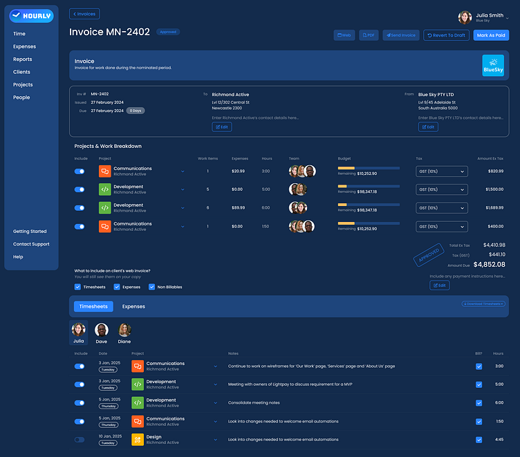
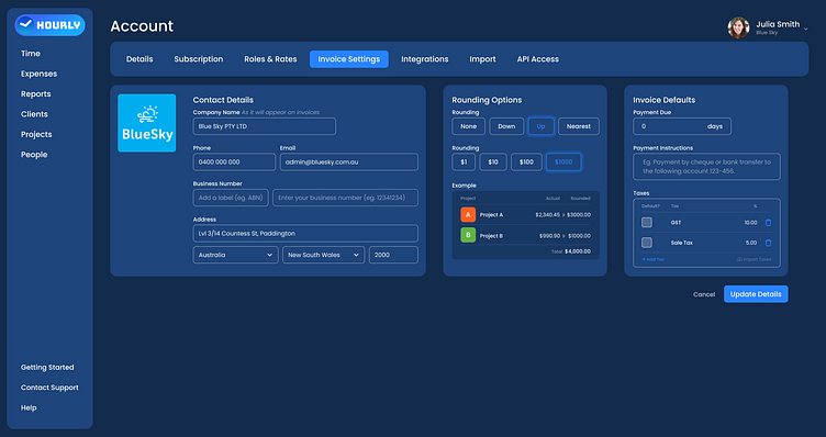
Above are a series of images showing some of the UI page mockups in light mode and then again in dark mode.
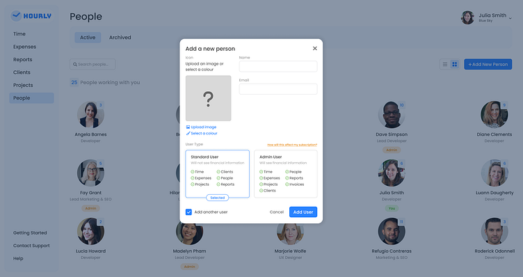
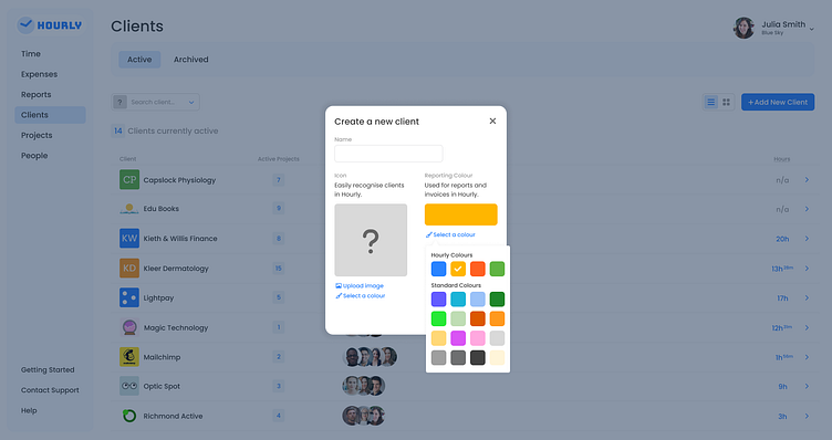
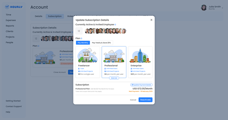
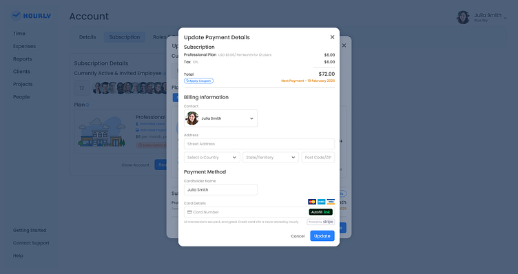
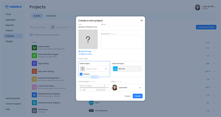
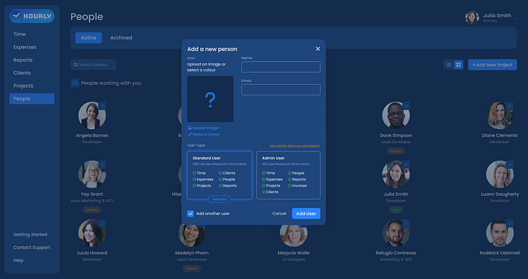

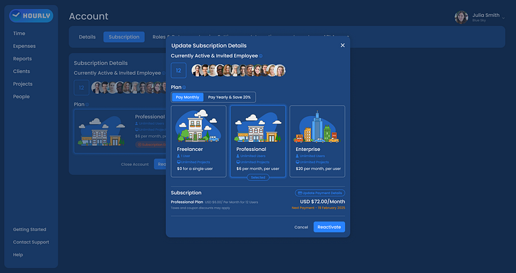
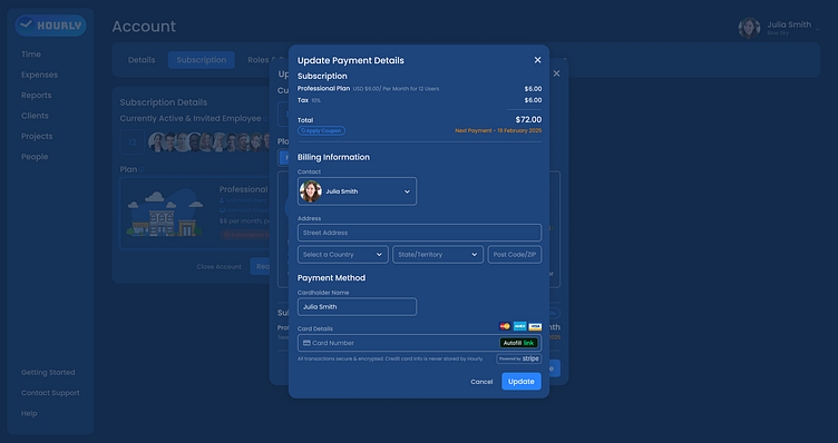
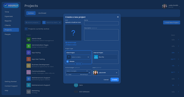
The above images are a few examples of dialogs/ modals within the Hourly app in light mode and in dark mode.
A video showing an example of hover and click interactions on the Reports page in the Hourly App. Animations created within Figma as a guide for developers.
