DoctorLogic Identity Redesign – A Cutting-Edge Healthcare Market
While researching healthcare marketing solutions for outreach, I came across DoctorLogic. Their platform is powerful, helping healthcare professionals grow online—but something felt off. Their Logo didn’t fully reflect their expertise as a marketing-first company.
What I Noticed
🔹 The logo leans too much toward clinical services, rather than digital marketing & growth.
🔹 No strong, unique brand symbol that differentiates it from healthcare providers.
🔹 The overall identity is functional but lacks a cutting-edge marketing presence.
I saw an opportunity to reimagine their identity—one that speaks to their real strength: helping doctors grow through marketing innovation.
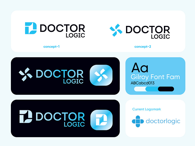
The Solution: Two Distinct Logo Concepts
✅ 1. Personal Connection Concept
🔸 Inspired by the letters L and D, shaped into a dynamic, rounded form.
🔸 Represents trust, approachability, and connection—just like DoctorLogic’s mission.
✅ 2. Abstract Medical Cross Concept
🔸 A modern, tech-driven take on the medical cross, featuring smooth, dynamic edges.
🔸 Balances healthcare symbolism with marketing innovation, reinforcing their expertise.
Why This Matters
DoctorLogic deserves a brand identity that:
🔹 Reflects its marketing-first approach rather than feeling like a healthcare provider.
🔹 Feels dynamic, innovative, and tech-savvy—just like the solutions they offer.
🔹 Builds trust and recognition while standing out in the healthcare marketing space.
👉 Which concept do you think best aligns with DoctorLogic’s vision? Let’s discuss in the comments!
🔥 If you love this transformation, hit Like & Follow for more identity redesigns!
