Nike Fictional Product Showcase
Revamped Product Details with Dynamic Composition
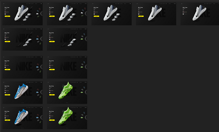
I applied a 4-16-32 scaling rule to create a multi-dimensional, dynamic layout that adapts fluidly across devices. Bold typography was strategically implemented to ensure the product’s key features stand out.
I revamped the Nike product showcase using my user testing approach. I kept it simple and smooth—listening to real users helped me tweak the design so everything feels natural and easy to use.
For a better user experience, I took a minimalistic design approach that focuses on three main areas:
_ Seamless navigation ( use a Plenty of white space, Accessible Interaction models to ensure that user can easily move around)
_ Clean Typeface(Futura, modern and clean look)
_ Reduced Cognitive Load (keeping it simple by displaying just the products and their variations)
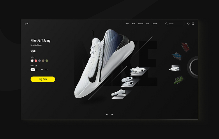
The result?
A user-friendly experience that leads to high conversion outcomes.
Let play the full prototype: Play Now
