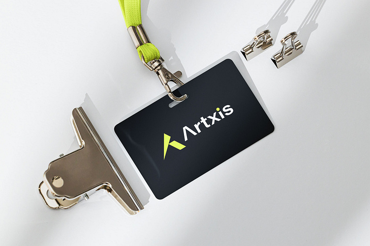
Artxis logo design
Hello guys 👋
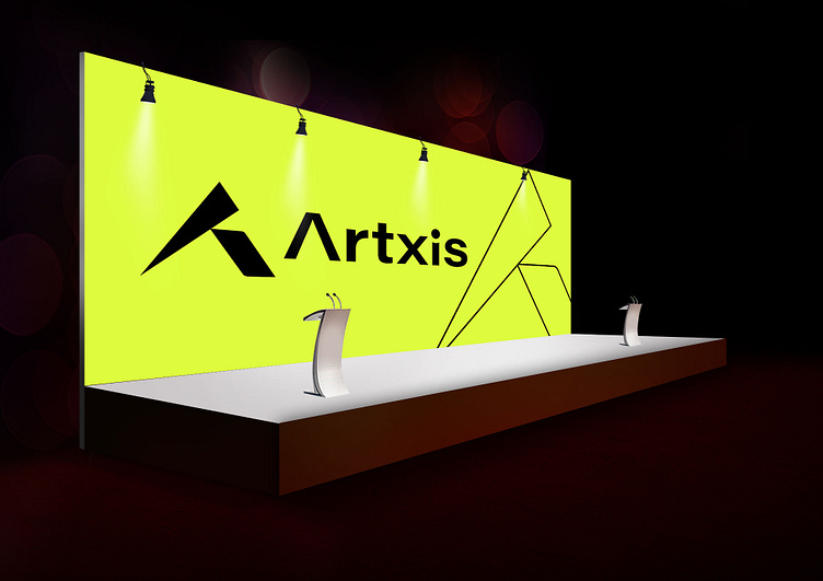
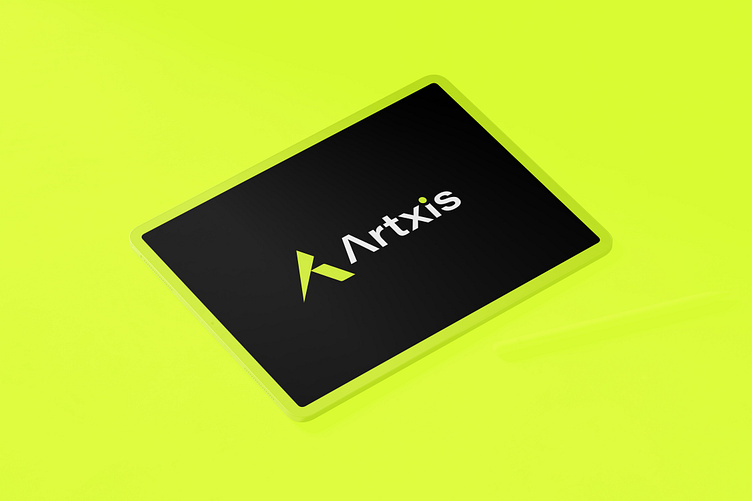
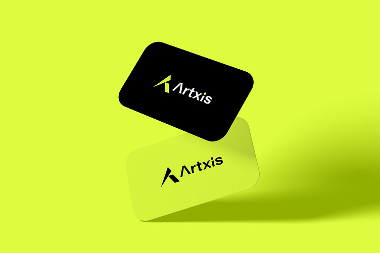
This is my recent work Artxis logo design (unused)
(Ready for sale)
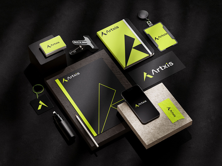
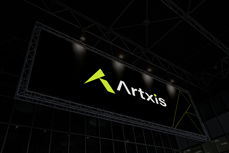
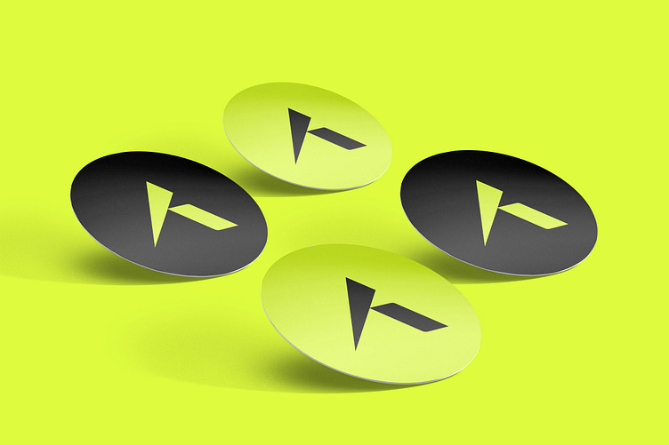
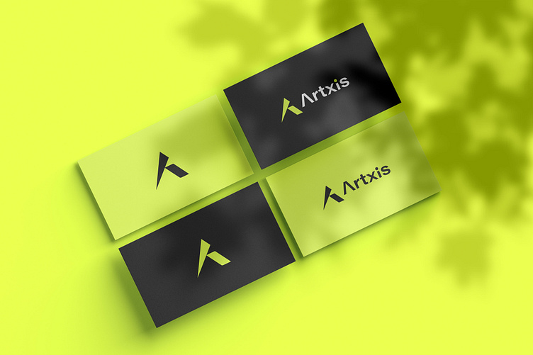
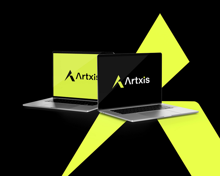
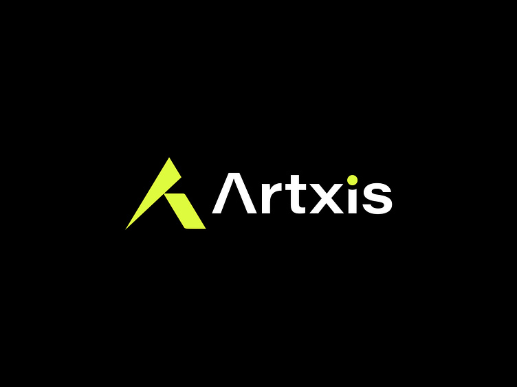
Artxis logo demonstrates a thoughtful design that aligns with the principles of UI/UX design, suggesting that the company applies the same level of care and attention to detail in their services.
The details of the logo are mentioned below:
Simplicity: The logo is simple and uses a minimalistic approach, which is a common practice in UI/UX design to ensure clarity and ease of recognition.
Color Choice: The use of a bright lime green color for the 'A' is eye-catching and can be associated with creativity and innovation, which are important qualities in the design industry.
Typography: The sans-serif font used for "Artxis" is clean and modern, which is often preferred in UI/UX design for its readability and professional appearance.
Iconography: The stylized 'A' could be interpreted as a dynamic shape, suggesting movement and transformation, which are relevant concepts in UI/UX design where the focus is on user interaction and experience.
Contrast: The contrast between the bright green and the dark background ensures that the logo stands out, which is important for visibility in various digital environments.
Uniqueness: The design is unique and does not closely resemble other logos, which is important for brand recognition in a competitive industry.
Do you want to design your company/brand/business/agency logo?
Contact for freelance work
e-Mail: robiulmahdiawal@gmail.com
What's App: +8801567924863
Follow Me Here
Twitter || Facebook || Instagram || Behance || Linkedin || Dribbble