WOZ | Visual Identity
Woz
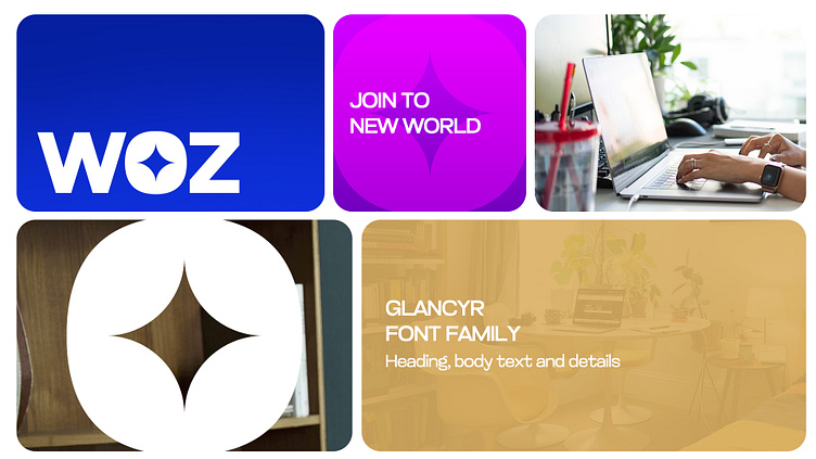
As the lead designer of this project, I developed a versatile brand identity for WOZ, a dynamic platform that spans multiple industries, from e-commerce to cryptocurrency. The goal was to create a recognizable and structured visual system that not only stands out but also conveys clarity and meaning through color psychology.
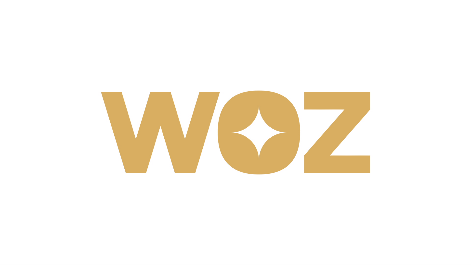
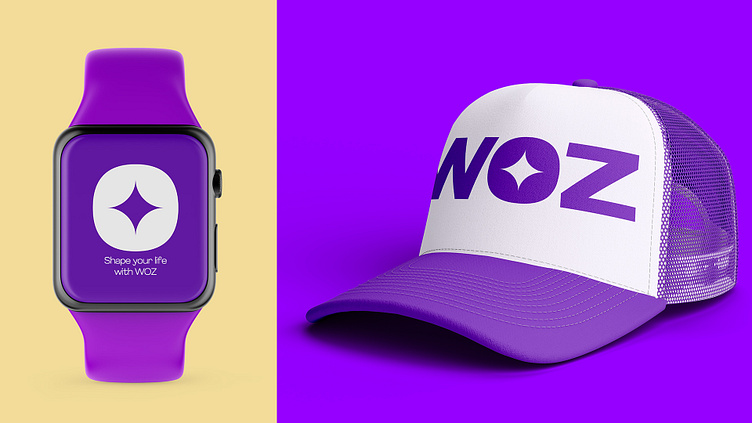
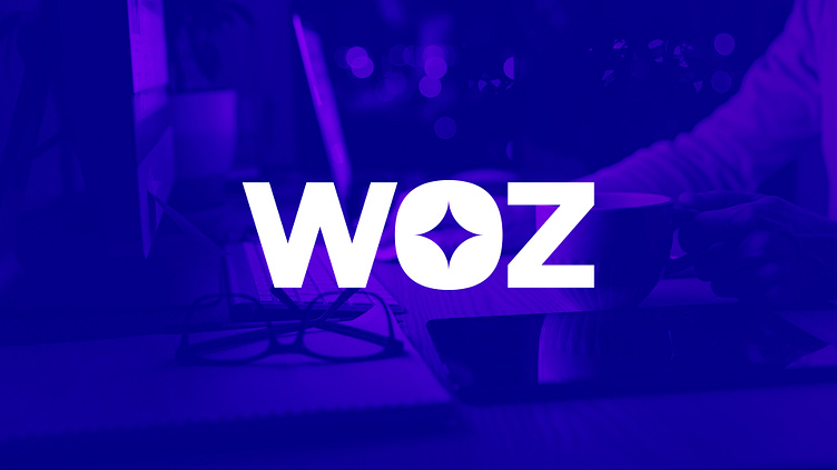
At the heart of the logo lies a distinctive design choice—the magic star embedded within the letter “O.” This symbol represents transformation, opportunity, and guidance, reflecting WOZ’s mission to empower and educate its audience.
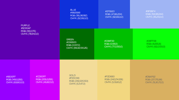
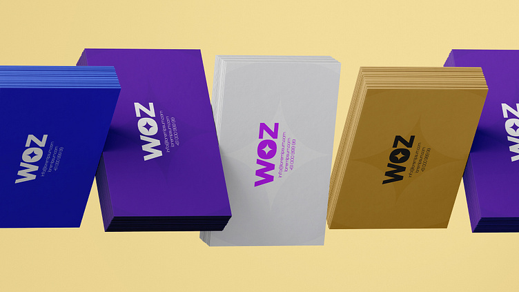
To reinforce consistency and recognition across different content categories, I designed a strategic color-coded system:
• Purple signifies education on making money online.
• Green represents Shopify and e-commerce discussions.
• Blue stands for mentorship and personal growth.
• Gold is dedicated to cryptocurrency and Bitcoin insights.
• White serves as a neutral and versatile option.
By implementing this system across social media, websites, and YouTube, WOZ establishes a seamless visual language. Over time, audiences will intuitively associate each color with its respective topic, enhancing brand engagement and recall.
The final identity is bold, modern, and impactful—built to not only capture attention but to create a lasting connection with its community.
WOX © 2024
Logo Design | Brand Identity